You’ve spent months building traffic to your website. The visitor numbers look good. But here’s the problem: they’re not converting.
Before you panic and consider a complete website overhaul, let me share something that might save you thousands of pounds and weeks of headaches. Most conversion problems don’t require a rebuild. They require small, strategic changes to the elements that matter most.
I’ve seen businesses increase conversions by 173% by simply moving a button above the fold. Another client saw a 295% lift by removing two form fields. These aren’t flukes. They’re the result of understanding what actually drives visitor behaviour.
Let’s look at the small changes that make the biggest impact.
Why Do Small Changes Matter More Than You Think?
Here’s the thing: your website visitors make split-second decisions. They’re not analysing every pixel. They’re scanning for signals that tell them whether to stay or leave, whether to trust you or bounce.
When you change a mission-critical element: even slightly: you’re directly influencing that decision-making process. A form with three fields instead of five? That’s less commitment required. A button that says “Get information” instead of “Submit”? That feels less formal and more helpful.
The impact compounds because these elements sit at critical moments in your customer journey. They’re the gatekeepers between interest and action.
Where Should You Start? (The Drop-Off Points That Matter)
You can’t fix everything at once. You shouldn’t try.
Start with the biggest leak in your conversion funnel. For most Bristol businesses we work with, that’s one of three places:
- The contact form (where interested visitors abandon at the last moment)
- The primary call-to-action (where confusion stops action)
- Page load speed (where impatience kills opportunity)
Track your analytics to see where visitors leave. That’s your starting point. Everything else comes second.
Form Optimisation: Less Really Is More
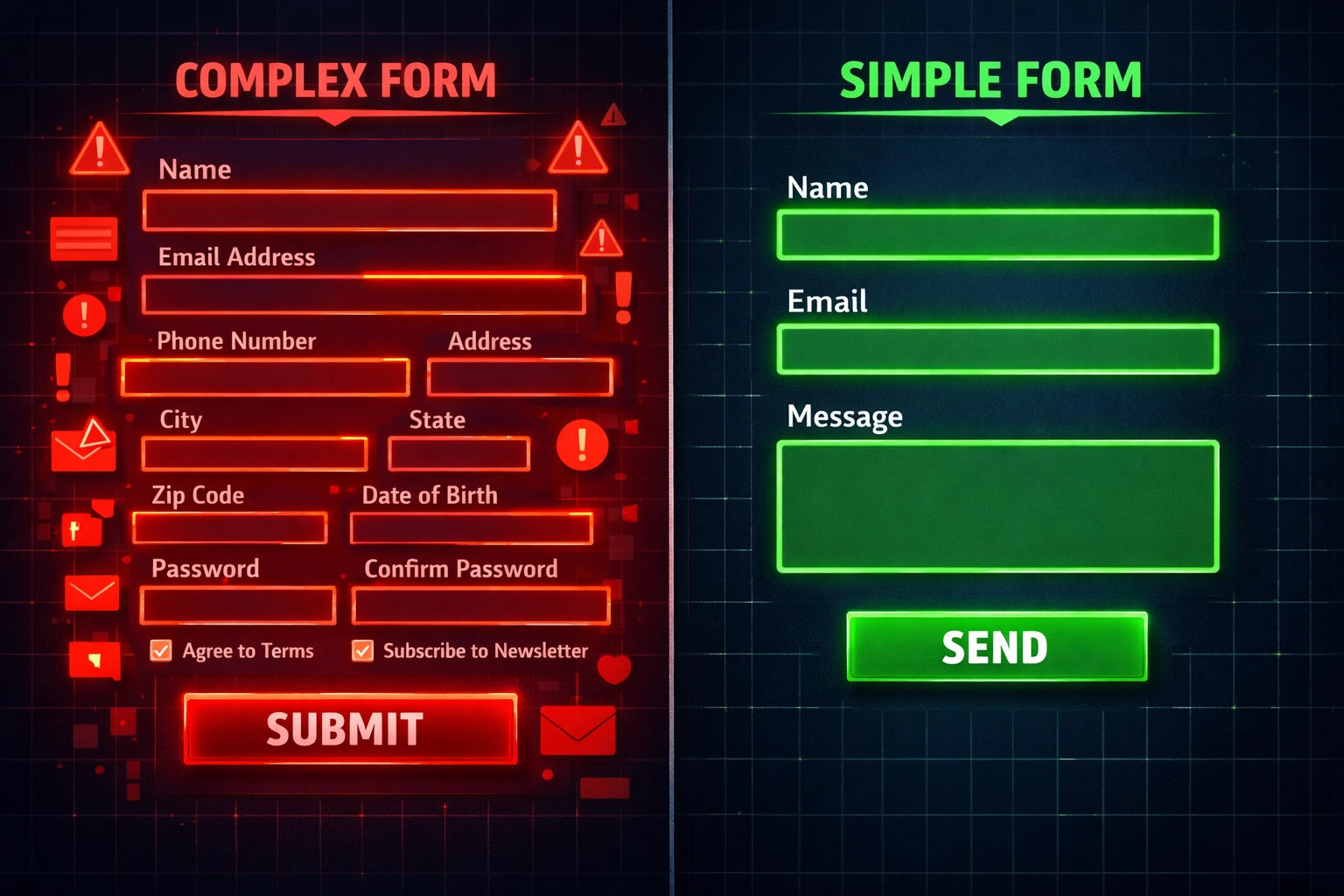
Let’s talk about forms. You want information. Your visitors want to give you the bare minimum. This tension kills conversions.
Here’s what we’ve learned: every additional form field costs you conversions. Not might cost you. Does cost you.
One of our Bristol clients was asking for name, email, phone number, company name, and a message. Five fields. Reasonable, right? We cut it to three: name, email, and message. The result? A 295% increase in form submissions.
Why This Works
Each field represents a micro-commitment. It requires thought, typing, and a small leap of trust. When you’re asking someone who barely knows you to provide five pieces of information, you’re asking for a lot of trust upfront.
Three fields feels manageable. Five feels like work.
What You Should Keep
Only ask for what you absolutely need for the initial contact. You can gather additional information later in the sales process when trust is established. For most businesses, that’s:
- Name (so you know who you’re speaking to)
- Email (so you can respond)
- What they need help with (so you’re prepared)
Phone number? Make it optional. Company size? Save it for the discovery call. Budget? Definitely wait.
Your Call-to-Action Buttons Are Costing You Money
Your CTA buttons seem like tiny details. They’re not. They’re the moment of decision, and small changes here create outsized results.
We changed one client’s button text from “Order Information and Prices” to “Get Information and Prices.” Same meaning, right? Wrong. The first sounds like you’re committing to something. The second sounds like you’re receiving something valuable.
That single word change increased conversions by 14.79%. On another site, a similar test achieved a 38.26% lift.
Button Positioning Matters More Than Colour
Everyone obsesses over button colour. Should it be orange or green? Here’s the truth: positioning matters more.
Moving primary and secondary CTAs above the fold: where visitors see them without scrolling: increased conversions by 173% for one business. Your visitors shouldn’t have to hunt for the next step.
What Makes a Good CTA
Your button copy should be action-oriented and benefit-focused. Compare these:
- “Submit” vs. “Get Your Free Quote”
- “Contact Us” vs. “Start Your Project”
- “Learn More” vs. “See How It Works”
The second option in each pair tells visitors what they’ll receive. The first just describes an action.

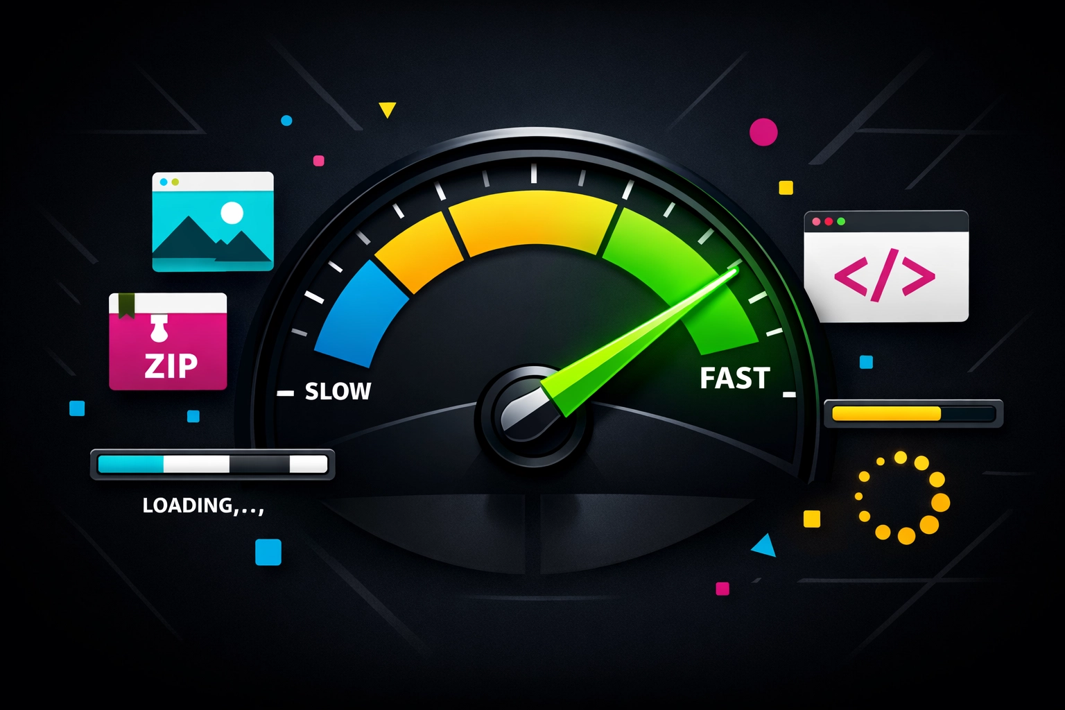
Page Speed: The Silent Conversion Killer
Your website loads slowly. You don’t notice because you’ve memorised the layout. Your visitors notice immediately because they’re impatient.
One of our clients minified their code: a technical process that removes unnecessary characters from files: and saw a 138% conversion increase. That’s not from redesigning anything. That’s from making existing pages load faster.
Why Speed Matters
Every second of load time costs you conversions. Google’s research shows that as page load time increases from one to five seconds, the probability of bounce increases by 90%. Your content could be brilliant, but if it takes four seconds to appear, most visitors will never see it.
Quick Wins for Speed
You don’t need to be a developer to improve speed. Start with:
- Compress images (most websites use images that are 10 times larger than necessary)
- Enable browser caching (so returning visitors load pages faster)
- Minimise redirects (each one adds loading time)
- Use a content delivery network (distributes your content geographically)
Our web design service includes speed optimisation as standard because we’ve seen how dramatically it affects results.
Social Proof: Getting the Balance Right
Adding customer reviews to your website increases conversions. But here’s where it gets interesting: more reviews don’t always mean better results.
One business added Google Reviews badges with testimonials and saw a 33% conversion increase. Makes sense. Social proof builds trust.
But another business reduced the number of displayed reviews whilst repositioning them higher on the page. Their conversions increased by 82%.
What This Tells Us
Quality and placement beat quantity. Your visitors don’t want to scroll through 50 reviews. They want to quickly see that other people like them had good experiences.
How to Use Reviews Effectively
Place 3-5 strong testimonials near your primary CTAs. Choose reviews that:
- Address specific concerns your prospects have
- Come from businesses similar to your target audience
- Mention tangible results, not just feelings
- Feel authentic (perfect reviews actually reduce trust)
Don’t bury them at the bottom of your page. Put them where decision-making happens.
Headlines and Copy: The Readability Factor
Your headline might be hurting you without you realising it. One business changed their headline font colour from orange to black and increased downloads by 6.64%.
That seems like nothing, right? But when you’re getting 10,000 visitors per month, that’s 664 additional conversions. From a colour change.
Why It Worked
Readability matters. If your visitors have to strain to read your headline, they won’t. They’ll leave. Black text on a white background is easier to read than orange. That’s it. That’s the whole insight.
Copy That Converts
Your copy should address specific pain points. Generic benefits don’t work. Specific solutions do.
Compare these headlines:
- “We Help Businesses Grow” (generic, could mean anything)
- “We Help Bristol Businesses Get More Qualified Leads from Google” (specific, addresses a pain point)
One of our clients tweaked their copy to directly address time concerns: their prospects were worried about how long implementation would take. That change generated an 18.59% conversion lift.
What Changes Should You Make First?
You’re probably wondering where to start. Here’s your priority list:
- Audit your forms – Count the fields. If there’s more than three, test removing some.
- Check your CTA positioning – Are your primary buttons above the fold on desktop and mobile?
- Test your page speed – Use Google PageSpeed Insights. If you’re below 80, you’ve got work to do.
- Review your button copy – Does it describe what visitors receive or just what they do?
- Position social proof strategically – Move your best testimonials near decision points.
Make one change at a time. Wait for statistically significant results before moving to the next change. If you change five things simultaneously, you won’t know which one worked.
The Mistake Most Businesses Make
Here’s what we see constantly: businesses obsess over design and ignore conversion mechanics. They spend thousands on making their website look beautiful whilst ignoring the fact that their contact form has seven fields and their CTA is below three paragraphs of text.
Beautiful design doesn’t convert. Design that removes friction converts.
Your website’s job isn’t to impress visitors. It’s to guide them towards a specific action with as little resistance as possible.
What This Means for Your Business
Small changes compound. A 10% improvement to your form conversion rate, combined with a 15% improvement from better CTA positioning, combined with a 20% improvement from faster page speed: these multiply.
You’re not getting additive gains. You’re getting multiplicative gains.
The businesses seeing the best results aren’t doing massive overhauls. They’re systematically testing and improving the elements that matter most.
If you’re ready to improve your website’s conversion rate, start with the biggest leak in your funnel. Test one change. Measure the results. Then move to the next priority.
Want help identifying your biggest conversion opportunities? Our digital marketing services include conversion audits that pinpoint exactly where you’re losing prospects and what to fix first.
The difference between a website that generates enquiries and one that doesn’t often comes down to a handful of small, strategic changes. Make them.
Frequently Asked Questions
1. Do I need a full website rebuild to improve conversions?
No. Most conversion problems don’t require a rebuild. They require small, strategic changes to the elements that matter most.
2. Why do small website changes have such a big impact on conversions?
Your website visitors make split-second decisions. Small changes to mission-critical elements directly influence whether they stay, trust you, and take action.
3. Where should I start when improving website conversions?
Start with the biggest leak in your conversion funnel. For most businesses, that is the contact form, the primary call-to-action, or page load speed.
4. Why does form optimisation improve conversions?
Every additional form field costs you conversions. Each field represents a micro-commitment, which increases effort and reduces the chances of submission.
5. What form fields should I keep on a contact form?
For most businesses, you only need name, email, and what they need help with. Other details can be gathered later when trust is established.
6. Why do CTA buttons affect conversion rates so much?
CTA buttons are the moment of decision. Small changes in wording and positioning can make the next step feel easier, more helpful, and less intimidating.
7. Does button position matter more than button colour?
Yes. Positioning matters more than colour. Visitors should not have to hunt for the next step, which is why placing CTAs above the fold can improve conversions.
8. Why is page speed important for conversions?
Every second of load time costs you conversions. If your website takes too long to load, visitors are more likely to leave before they even see your content.
9. How should I use social proof on my website?
Use 3 to 5 strong testimonials near your primary CTAs. Quality and placement matter more than the number of reviews on the page.
10. What is the biggest mistake businesses make with website conversions?
They obsess over design and ignore conversion mechanics. Beautiful design does not convert if the site still creates friction for visitors.