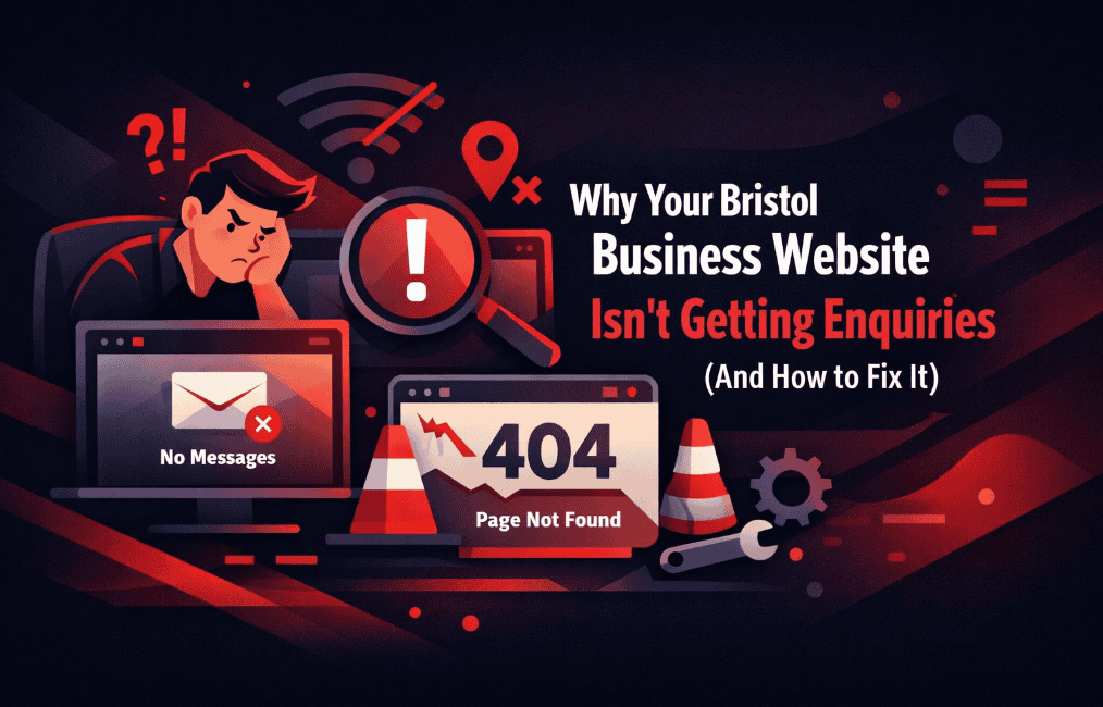
You’ve got a website. It looks decent enough. Maybe you even spent a fair bit on it. But here’s the problem: your phone isn’t ringing, your inbox isn’t filling up, and you’re wondering what the hell you’re paying for.
Sound familiar?
Here’s the thing: most Bristol business websites aren’t failing because they’re ugly or outdated (though that doesn’t help). They’re failing because they’ve built barriers between visitors and enquiries without even realising it.
Let me show you exactly what’s going wrong and how to fix it.
The Real Reason Your Website Isn’t Converting
Let’s start with the uncomfortable truth: if your website isn’t getting you enquiries, it’s not doing its job. Full stop.
But why? After working with dozens of Bristol businesses over the years, I’ve seen the same patterns emerge again and again.
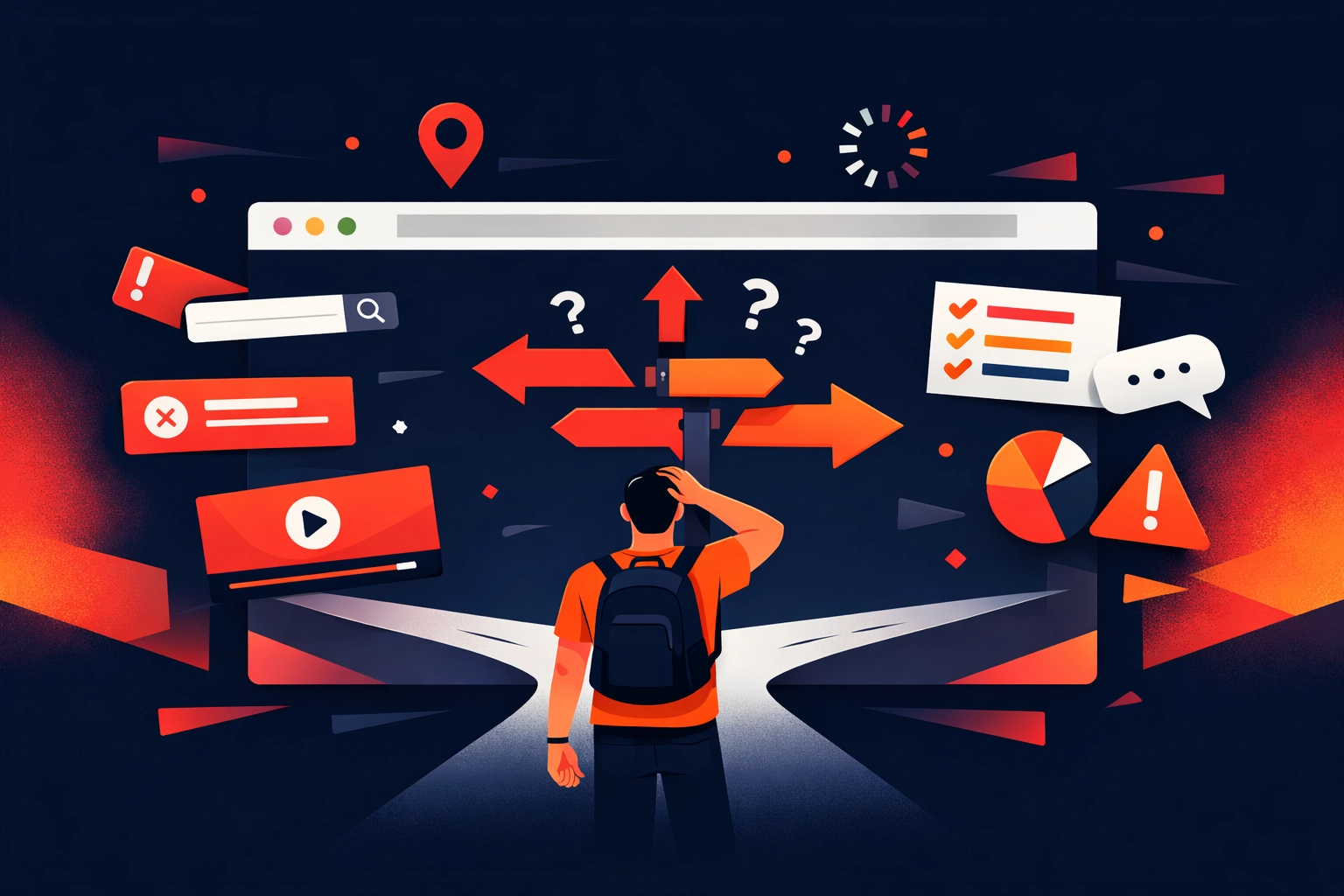
Your visitors are confused about what to do next.
Most websites are like walking into a shop where the staff ignore you and all the signs point in different directions. Visitors land on your site, scroll around for a bit, and leave because they can’t figure out what action they’re supposed to take.
Is it fill in a form? Call you? Book a meeting? Download something?
If you have to think about it, your visitors definitely have to think about it. And when people have to think too hard, they leave.
Your data is lying to you (or you’re not looking at it at all).
Here’s a question: do you actually know where your visitors are dropping off? Which pages they’re spending time on? What percentage of people who visit your contact page actually fill in the form?
If you don’t have accurate analytics set up, you’re flying blind. You might think your homepage is the problem when actually it’s your pricing page that’s scaring people away. Or you might assume mobile users are converting when they’re actually bouncing at twice the rate of desktop visitors.
Your landing pages are working against you.
Picture this: someone clicks on your Google ad or finds you in search results. They’re interested. They land on your page and… it’s cluttered. There’s information everywhere. Six different calls to action. A wall of text about your company history.
Within seconds, they’ve hit the back button.
Clean, focused landing pages convert. Messy ones don’t. It’s that simple.
Your call-to-action buttons are invisible (or terrible).
I’ve seen websites where the main CTA is a tiny grey button at the bottom of the page that says “Submit.” That’s not a call to action. That’s a missed opportunity.
Some businesses have increased their homepage conversion rates by over 100% just by changing their CTA copy from something generic like “Learn More” to something specific like “Get Your Free Website Audit.”
The button matters. The words on the button matter even more.
How to Actually Fix Your Conversion Problem
Right, enough about what’s broken. Let’s talk about how to fix it.
This isn’t a quick fix situation. You won’t change your button colour and suddenly triple your enquiries overnight. But if you follow this process systematically, you will see results.
1. Get Your Data Sorted First
Before you change anything, you need to know what you’re measuring.
Set up Google Analytics properly (or get someone who knows what they’re doing to set it up). Track different conversion types separately: phone calls, form submissions, email clicks, chat conversations.
Create custom reports that show you:
- Which pages people visit before they enquire
- Where people are dropping off
- How long it takes someone to convert
- Which traffic sources bring you quality leads versus time-wasters
Once you have accurate data, you’ll stop guessing and start knowing.
2. Watch What Your Visitors Actually Do
Numbers tell you what’s happening. Heat tracking shows you why.
Use tools like Hotjar or Microsoft Clarity (it’s free) to record actual visitor sessions. Watch where people click, how far they scroll, where their mouse hovers, and where they abandon your forms.
You’ll spot patterns you never expected. Maybe everyone’s clicking on an image that isn’t clickable. Maybe they’re not scrolling far enough to see your contact form. Maybe they’re filling in half your enquiry form and then giving up because you’re asking for too much information.
This is gold dust for understanding friction points.
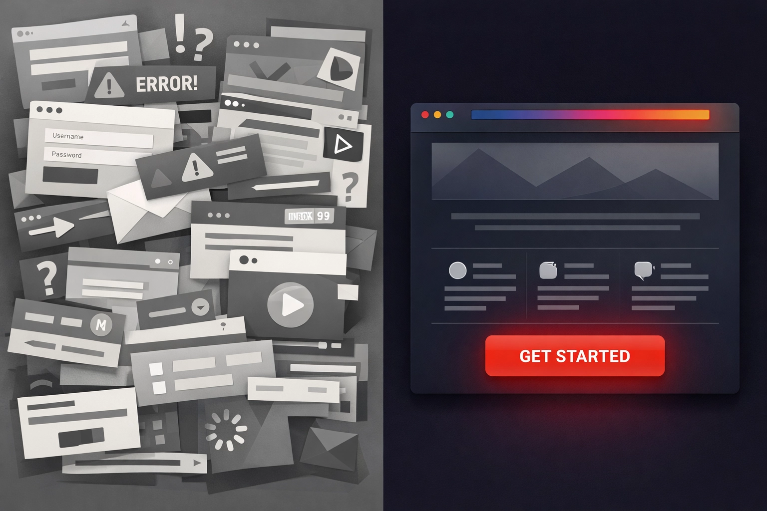
3. Clean Up Your Landing Pages
Your landing pages need one job: get the visitor to take the next step. Not five steps. One step.
Here’s what a high-converting landing page looks like:
- Clear headline that matches what the visitor was expecting
- Focused message explaining exactly what you’re offering and why it matters
- Relevant imagery showing your product, service, or happy customers
- Social proof like reviews or testimonials (people trust other people more than they trust you)
- One clear call to action that stands out and tells them exactly what to do
Cut everything else. Seriously. Every extra link, every sidebar widget, every “While you’re here, check out…” distraction reduces your conversion rate.
If you want someone to request a quote for website design in Bristol, make that the only obvious thing they can do on that page.

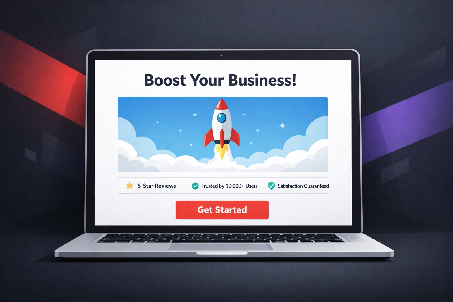
4. Make Your CTA Impossible to Miss
Your call-to-action button should be:
Big enough to notice without being obnoxious. If someone has to hunt for it, you’ve already lost them.
Contrasting in colour from everything else on the page. If your website is blue, your CTA shouldn’t be a slightly different shade of blue.
Action-oriented in language. “Get Started,” “Request Your Quote,” “Book Your Free Consultation” all work better than “Submit” or “Click Here.”
Repeated at logical points. Don’t make someone scroll back to the top if they’ve read to the bottom and are now ready to act.
Test different variations. What works for one audience might not work for another. A solicitor’s CTA might be more conservative (“Arrange a Confidential Call”) while a creative agency might be more casual (“Let’s Chat About Your Project”).
5. Test, Measure, Repeat
Here’s where most Bristol businesses give up too early. They change something, don’t see immediate results, and assume nothing works.
Conversion rate optimisation is a process, not an event.
Run A/B tests on:
- Different headline variations
- CTA button colours and copy
- Page layouts
- Length of content (sometimes more content converts better, sometimes less does)
- Form fields (every extra field you ask for reduces conversions)
- Trust indicators (awards, accreditations, client logos)
Give each test at least two weeks and enough traffic to be statistically significant. Track the results. Keep what works. Dump what doesn’t.
Over three to six months, these incremental improvements add up. Agencies who do this properly often see conversion increases of 35% or more.
6. Map Your Customer Journey
Not everyone who lands on your website is ready to buy right now. Some are just starting their research. Others are comparing options. A few are ready to pull the trigger today.
Your website needs to cater to all of them.
Think about the journey:
- Where do people enter your website? (Homepage? Blog post? Service page?)
- What do they look at next?
- What questions do they need answered before they’ll enquire?
- What final objections do you need to overcome?
Focus your conversion efforts on the highest-impact parts of this journey. If most people who view your pricing page end up enquiring, make sure every important page on your site links to your pricing page.
If most people who read your case studies convert, create more case studies and make them easier to find.
What This Means for Your Bristol Business
Look, I’m not going to pretend this is easy. Fixing a website that isn’t converting takes time, effort, and often some investment in web design improvements.
But here’s the reality: every day your website isn’t converting is a day you’re losing potential customers to competitors who’ve figured this out.
The good news? Once you’ve identified and fixed these issues, the results compound. A website that converts at 2% instead of 1% doesn’t just get you twice as many enquiries: it doubles your return on every pound you spend on marketing.
Whether you tackle this yourself or work with someone who specialises in conversion optimisation, the key is to start. Pick one thing from this list. Audit your data. Watch some session recordings. Rewrite your homepage CTA.
Small improvements add up to significant results. And significant results mean more enquiries, more customers, and more revenue for your Bristol business.
That’s what a website is supposed to do.
Frequently Asked Questions
Why isn’t my Bristol business website getting enquiries?
Most websites fail because visitors are confused about what to do next or face too many barriers before taking action.
How do I know where visitors are dropping off on my website?
You need properly set up analytics to track user behaviour, including page visits, time on site, and conversion paths.
What makes a landing page convert better?
A high-converting landing page has a clear message, focused content, relevant visuals, social proof, and one strong call to action.
Why are call-to-action buttons so important?
CTA buttons guide users to take action, and poor placement or weak wording can significantly reduce conversion rates.
What tools can help me understand user behaviour?
Tools like Hotjar or Microsoft Clarity show how visitors interact with your site, including clicks, scrolling, and drop-off points.
How can I improve my website’s conversion rate?
Improve clarity, simplify pages, strengthen CTAs, and remove distractions that prevent users from taking action.
What is conversion rate optimisation (CRO)?
CRO is the process of testing and improving elements of your website to increase the percentage of visitors who become leads.
Why should I run A/B tests on my website?
A/B testing helps identify what works best by comparing variations of headlines, layouts, and CTAs to improve results over time.
How does customer journey mapping help conversions?
Understanding how visitors move through your site helps you remove friction and guide them towards taking action.
How long does it take to see improvements in enquiries?
Results build over time, with consistent testing and optimisation typically showing meaningful improvements within three to six months.